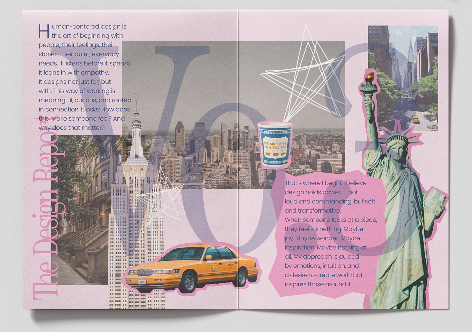
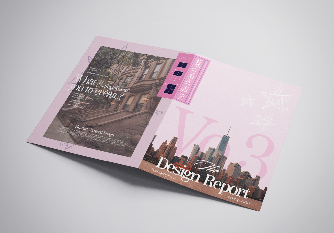
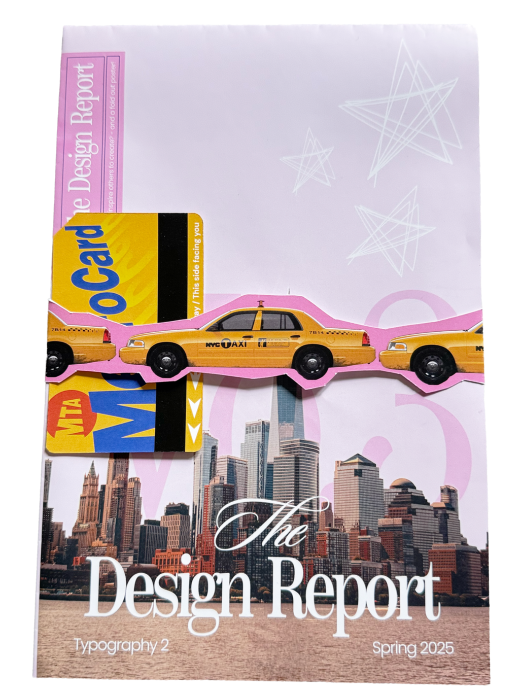
Typography 2: Posterzine
This poster-zine was created as part of a seven-week project centered on exploring personal creative practice while introducing a range of design disciplines. The final deliverables included a printed poster-zine with a subway car bellyband and a New York Metro–themed insert card. The objective was to visually express my design identity in a way that feels both playful and intentional.
Influenced by editorial and magazine design, the piece uses publication-inspired typography to reflect my connection to print culture. Layered imagery, text, and graphic elements add depth to the two-dimensional format, referencing the energy and structure of magazine spreads. New York City imagery represents creativity, individuality, and fast-paced momentum—qualities that align with both my personal and professional design approach. A palette of pinks and deep blue-purples balances softness and boldness, while a structured grid system ensures clarity, hierarchy, and cohesion within the collage-style layout. Together, these choices form an engaging piece that captures my evolving visual voice as a designer.
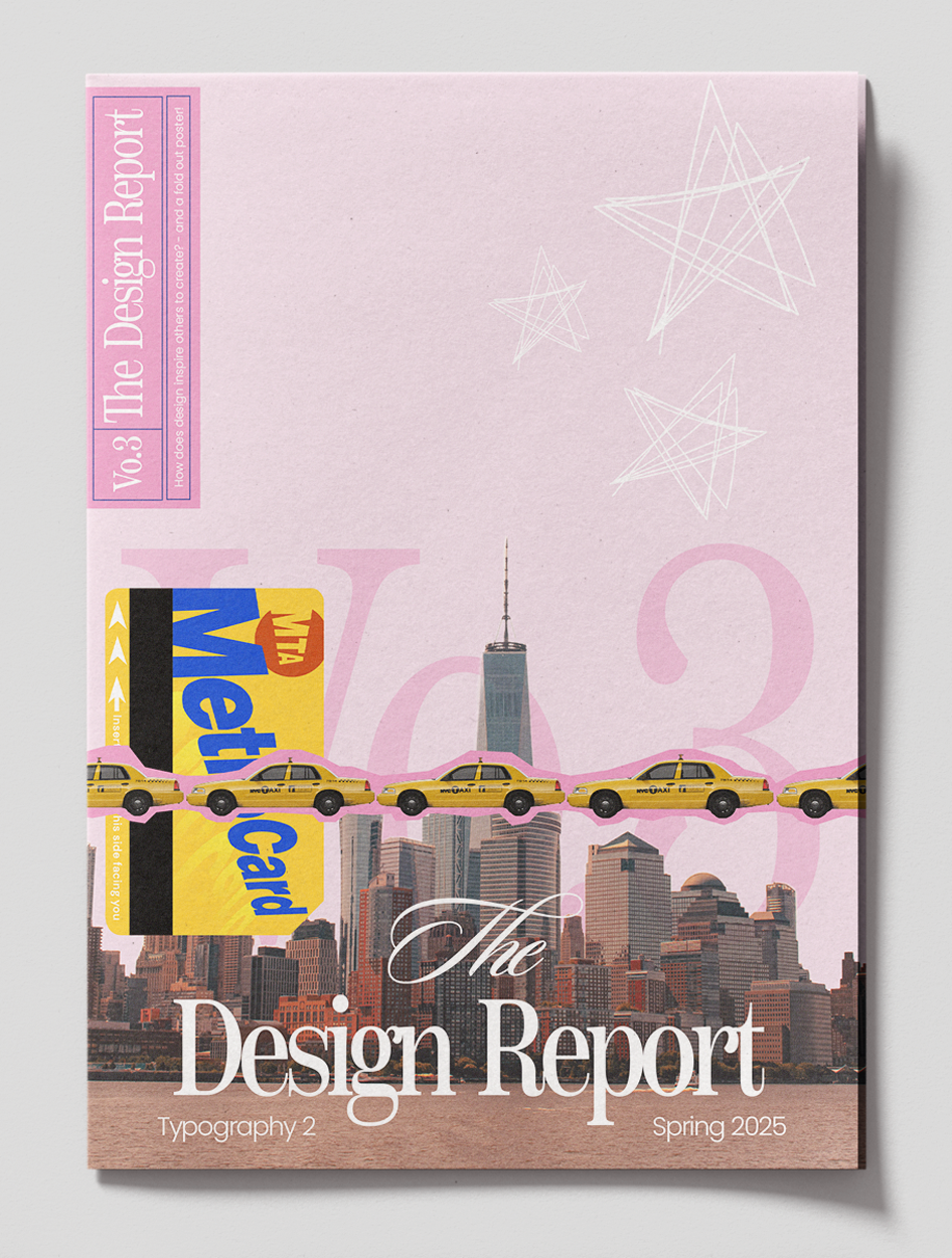
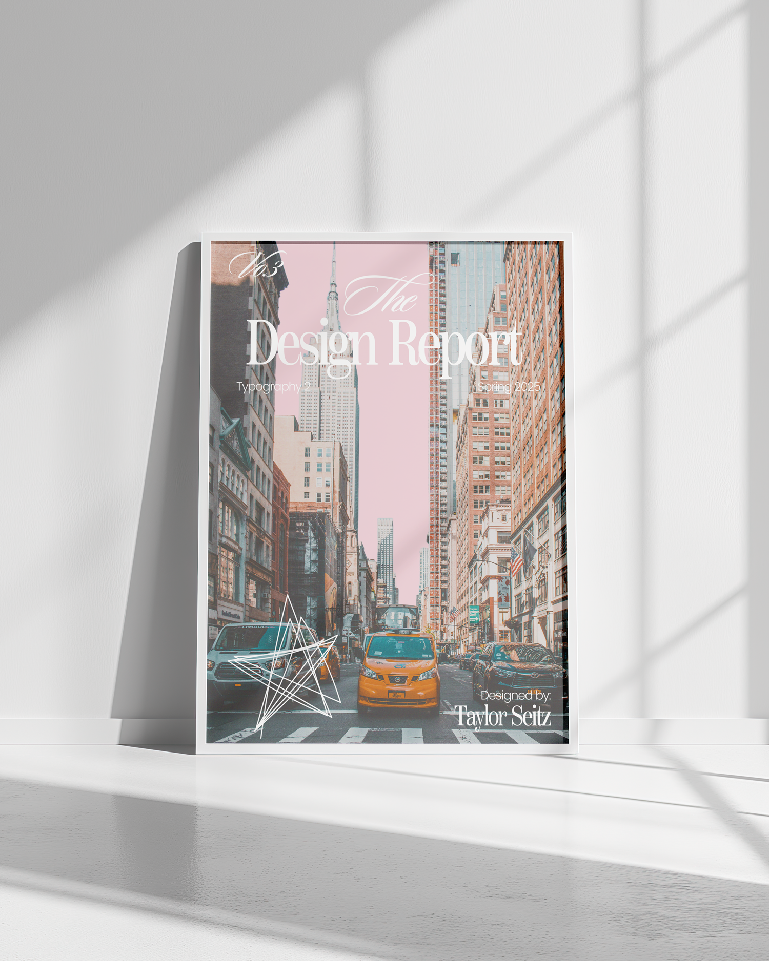
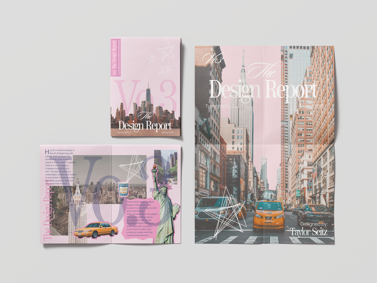
My finished Project is a playful yet intentional expression of my design identity, blending editorial-inspired typography with layered imagery and bold color choices. Drawing on the energy and individuality of New York City, the piece balances structured layouts with expressive, collage-style elements. The final design reflects my connection to print culture while capturing a dynamic, confident visual voice.
Process
This project developed through an exploratory process rooted in mood boarding, editorial research, and visual experimentation. I drew inspiration from magazine layouts, expressive typography, and layered collage elements, allowing recurring motifs to guide the direction of the design. New York City imagery became a central anchor, representing movement and creative energy, while structured grids and thoughtful color choices brought balance to the final piece.