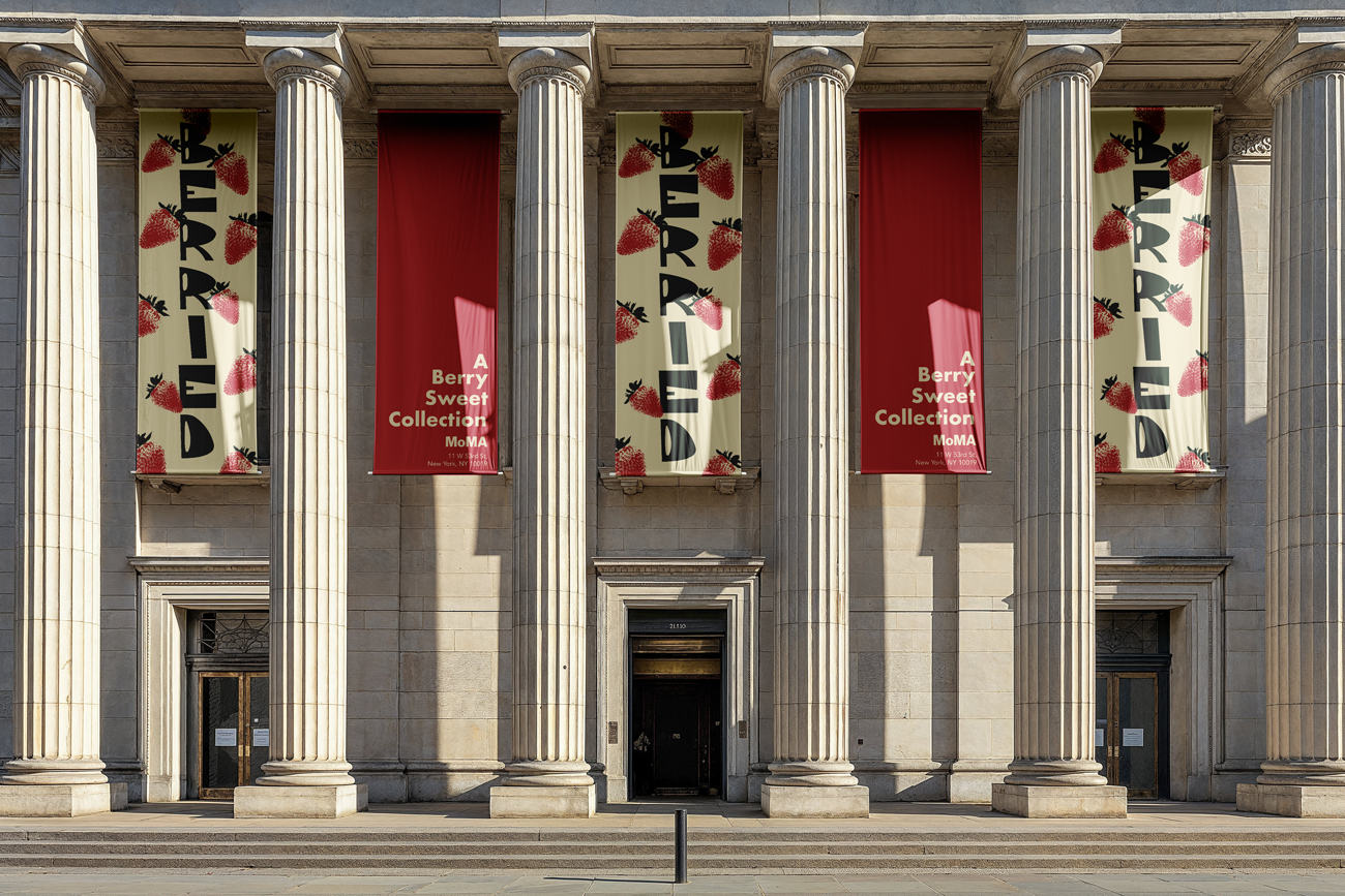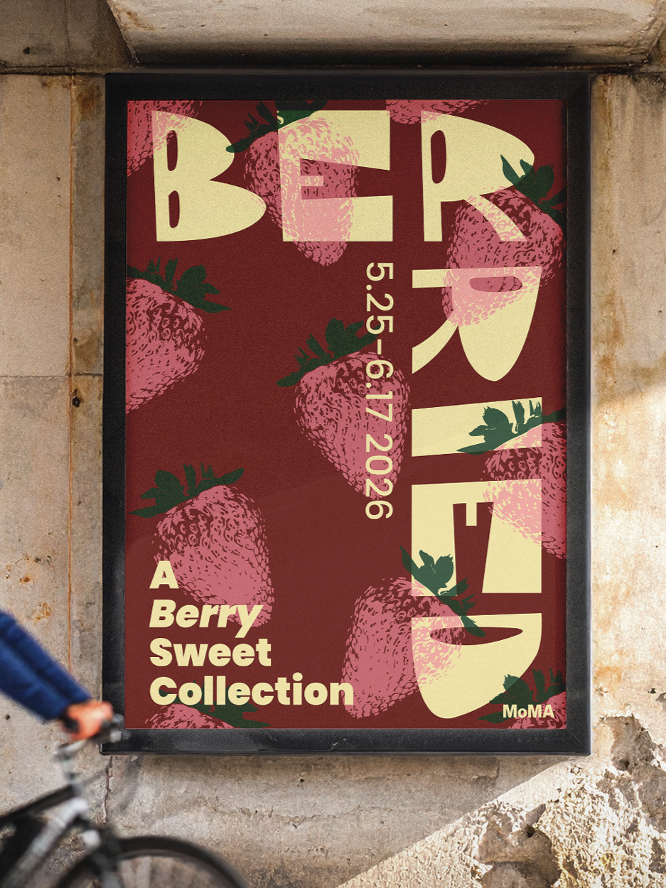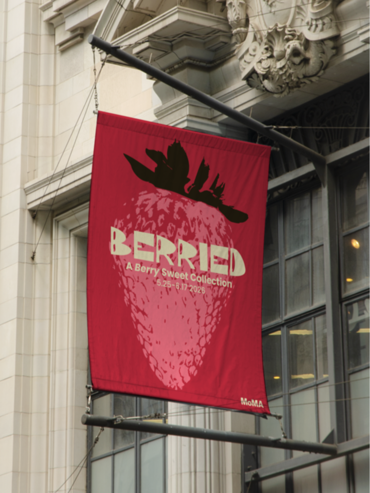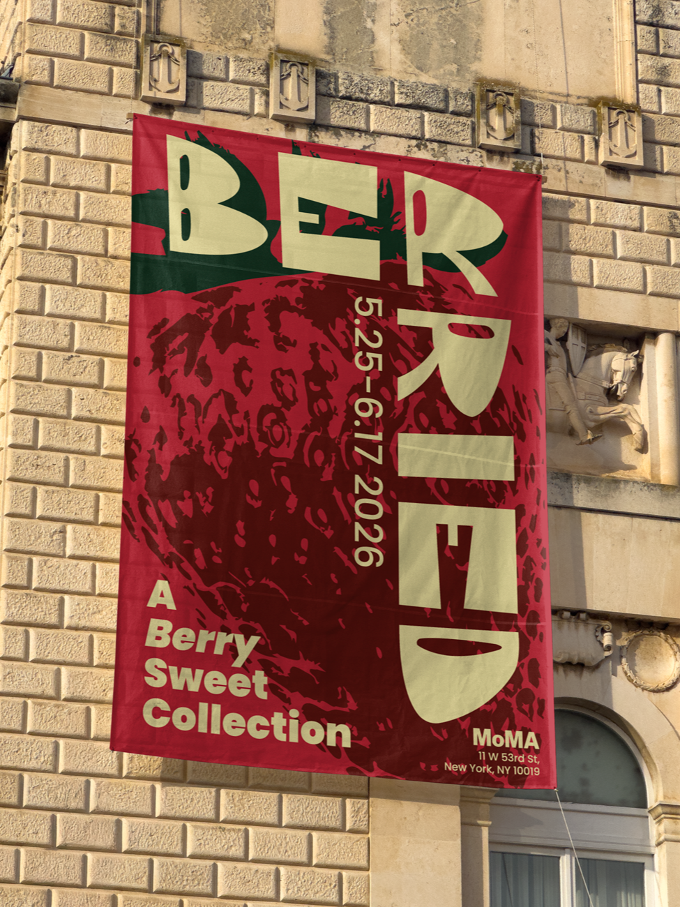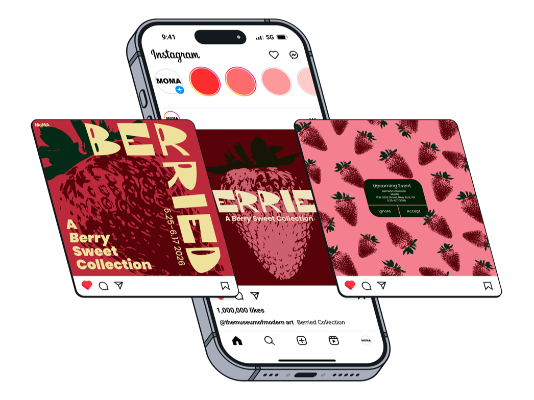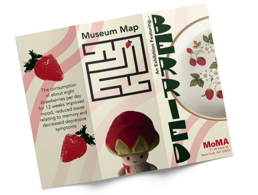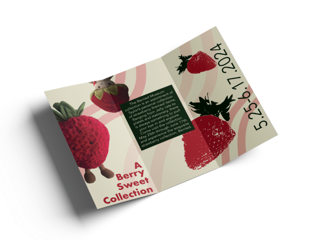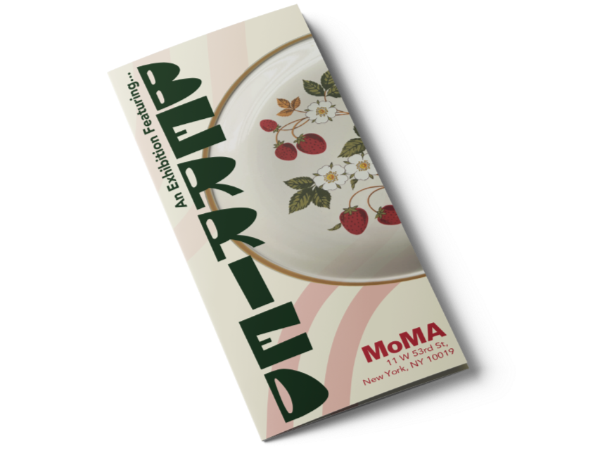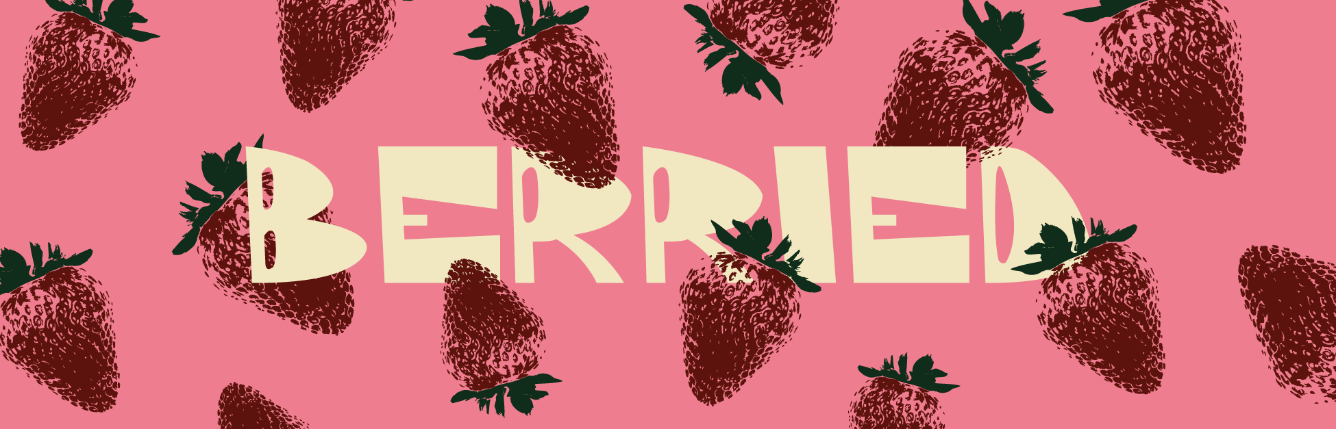
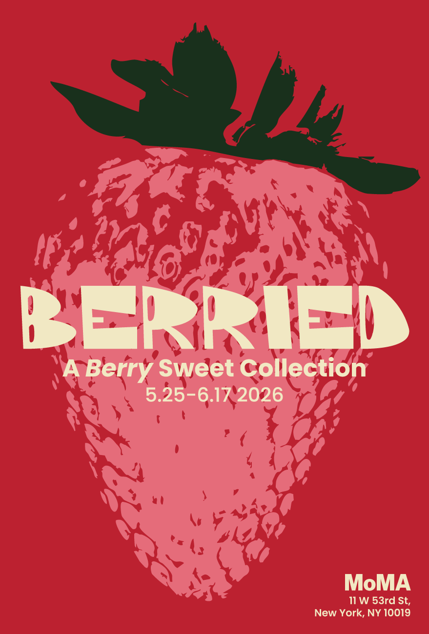
Intro to Design: Berried
The Berried Collection is a celebration of my love for strawberries and the berry-themed trinkets I’ve collected over time. The project includes a brochure, poster, and digital pieces designed for display at the Museum of Modern Art, all working together to tell a vibrant and cohesive visual story. Inspired by the sweetness and personality of strawberries, the collection embraces warmth, playfulness, and joy while remaining intentional and refined.