Unbound
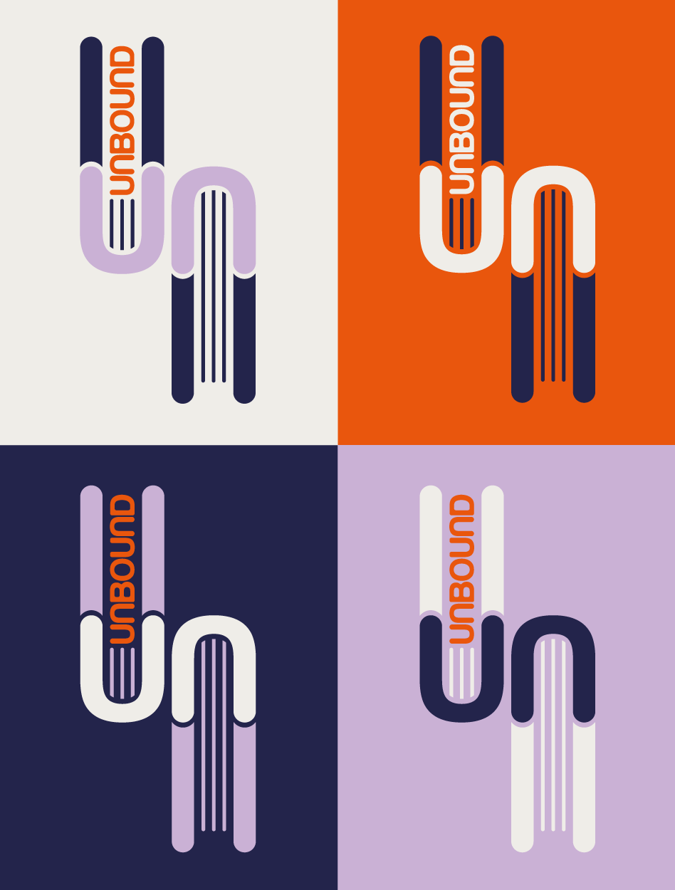
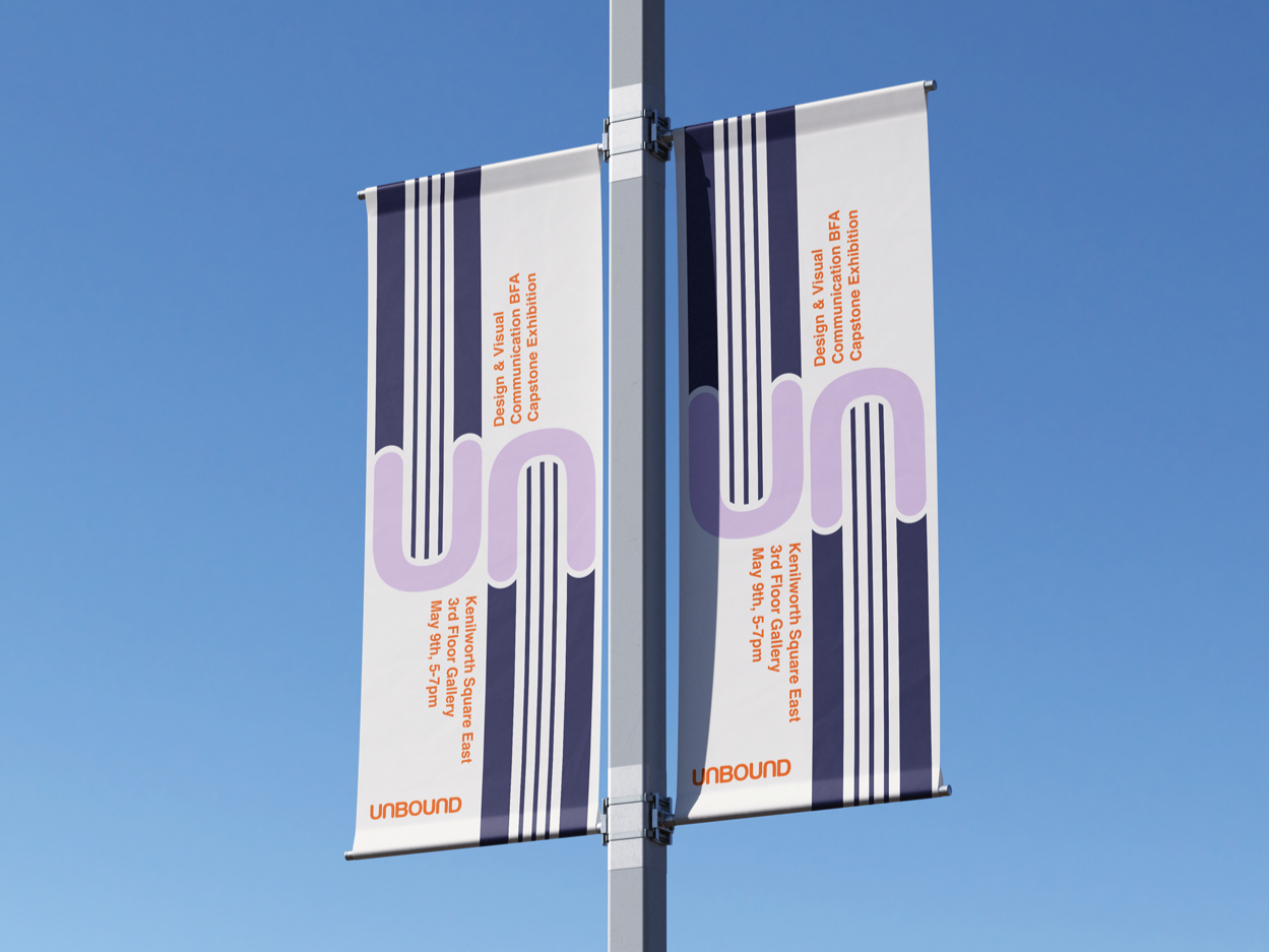
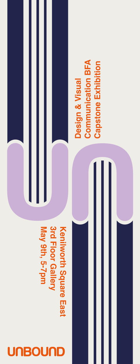
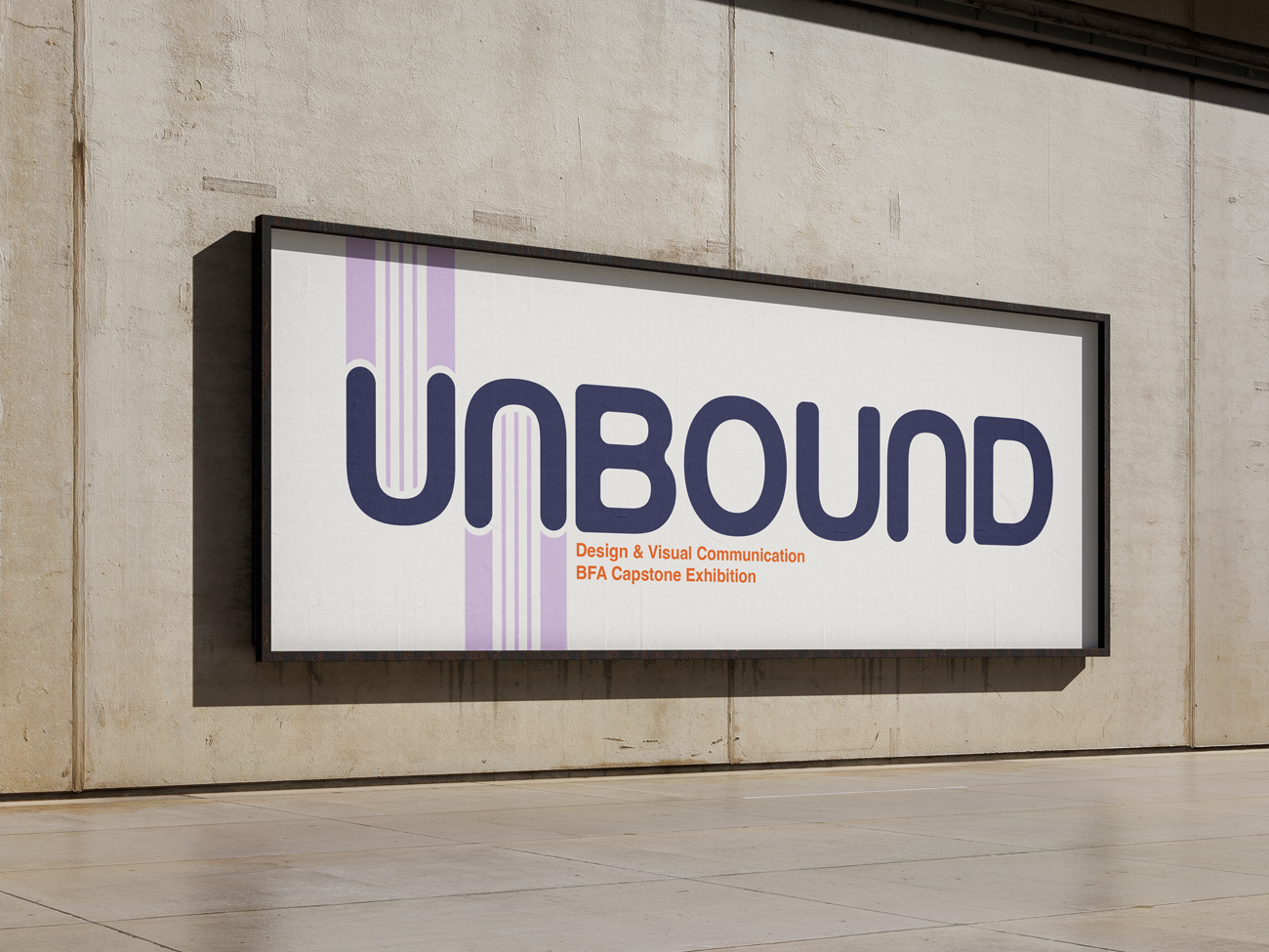
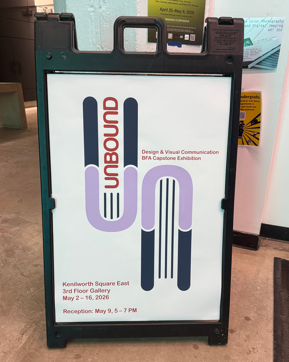
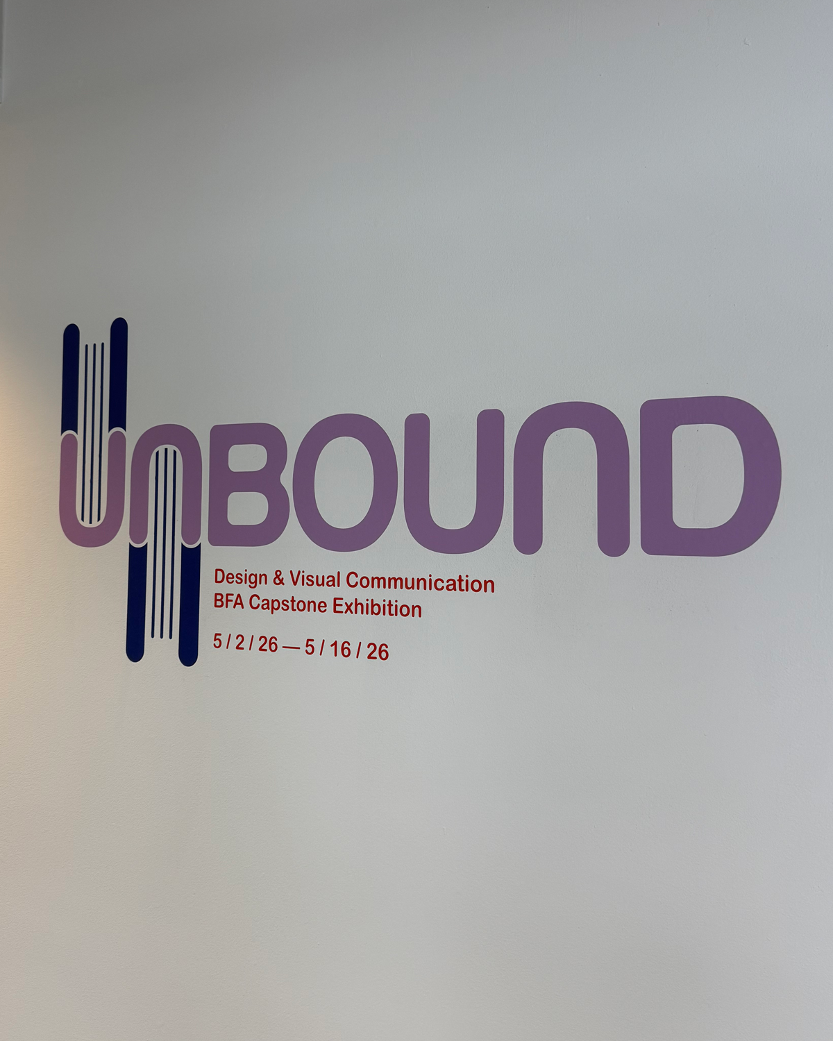
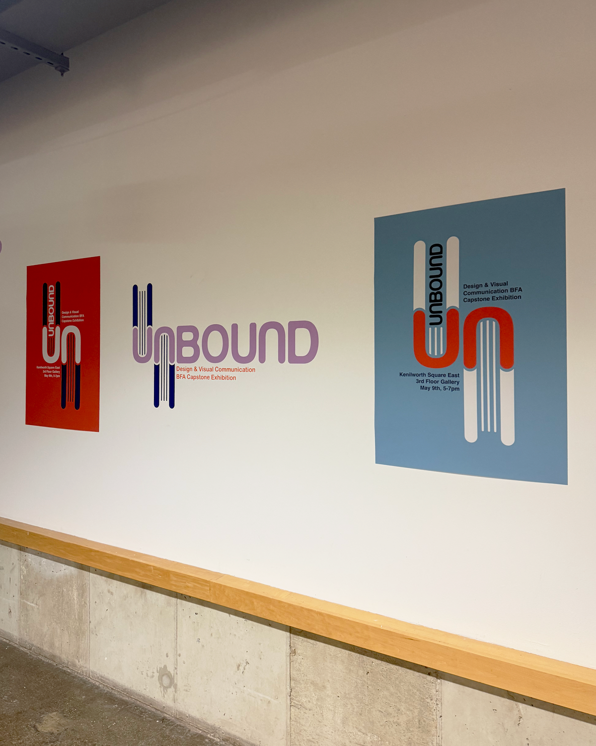
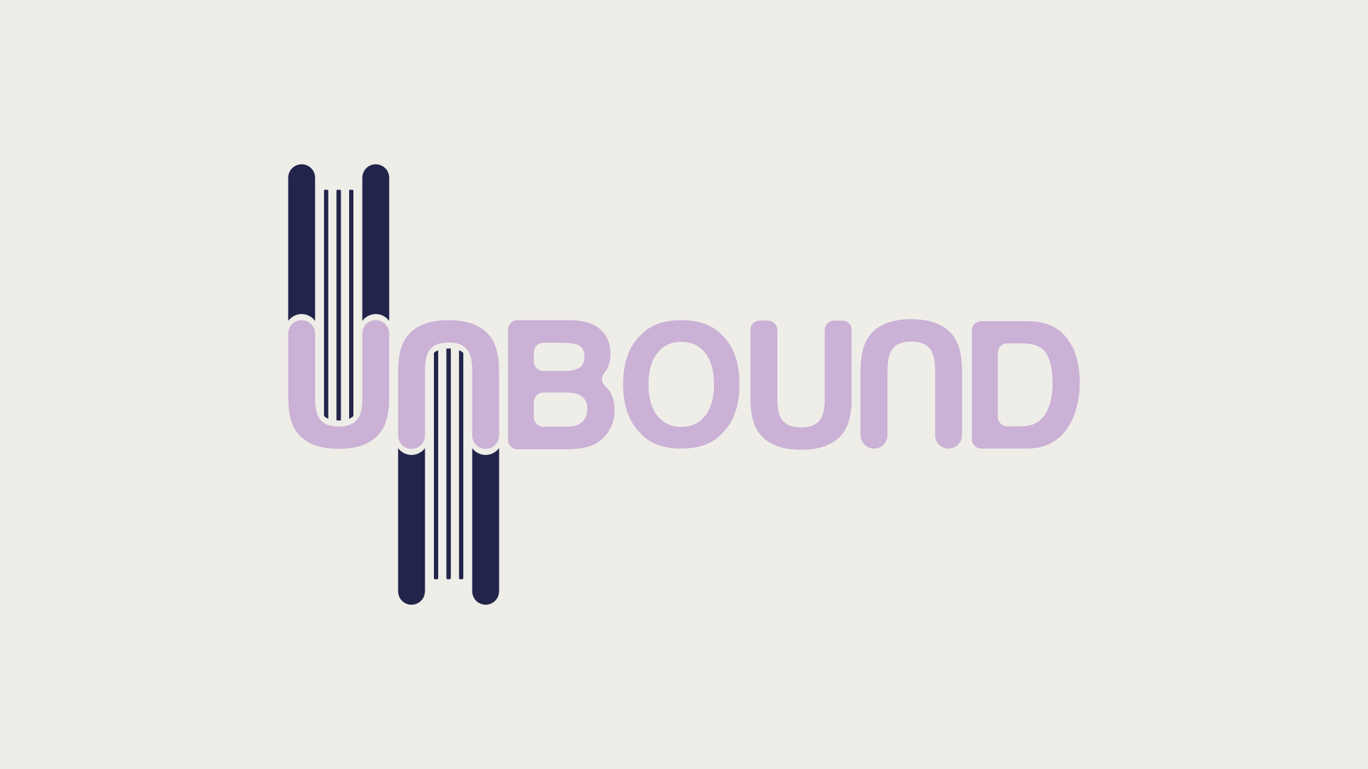
For this exhibition branding, I created a bold, inviting identity that reflects the diverse personalities and work of the graduating students. Inspired by the student-made books featured in the show, the word mark subtly references books stacked on a shelf through repeated, rotated letterforms and extended lines, allowing the concept to emerge naturally rather than relying on a literal book icon.